The Product
A grocery finder app designed to help shoppers quickly and easily locate grocery items while in the store.
Problem Overview
Grocery Finder App
The Problem
Shoppers can waste time searching for grocery items and become frustrated when store apps are difficult to navigate.
The Goal
Create a simple, intuitive experience that helps shoppers find grocery items quickly and easily.
Summary
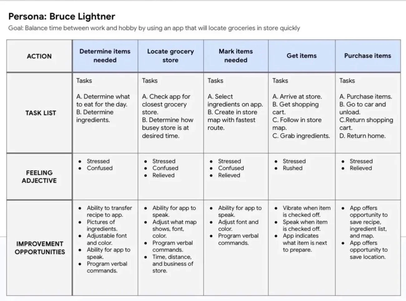
I reviewed existing user research to better understand the needs and frustrations of grocery shoppers. I initially assumed that balancing work, family, and personal time would be the primary challenge. The research revealed additional accessibility needs, particularly for older adults and people with disabilities who may find navigating a grocery store more physically challenging or time-consuming.
User Research
Pain Points
1 - Balance time
2 - Buying groceries
3 - Ordering groceries
4 - Easy app use
Journey Map
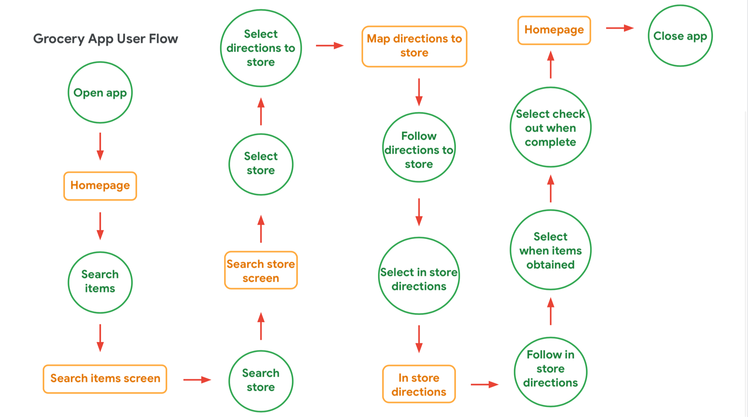
User Flow
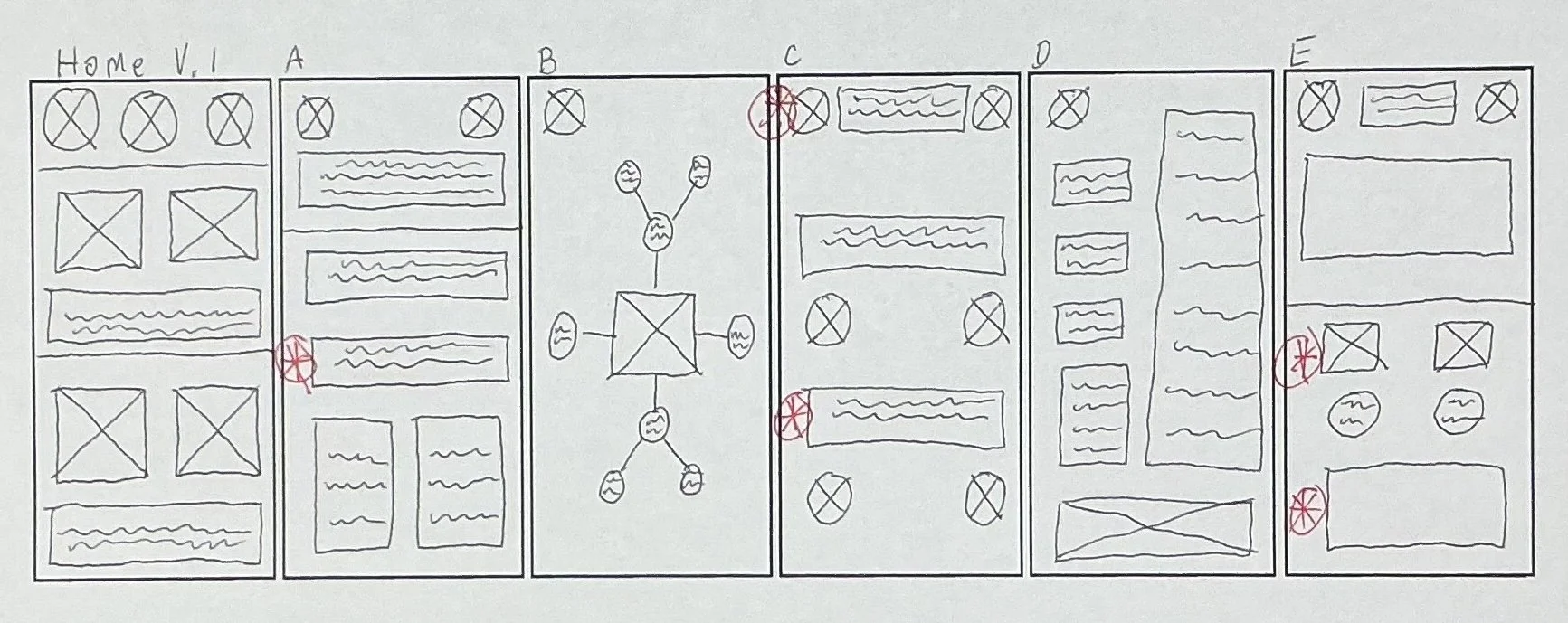
Paper Wireframe
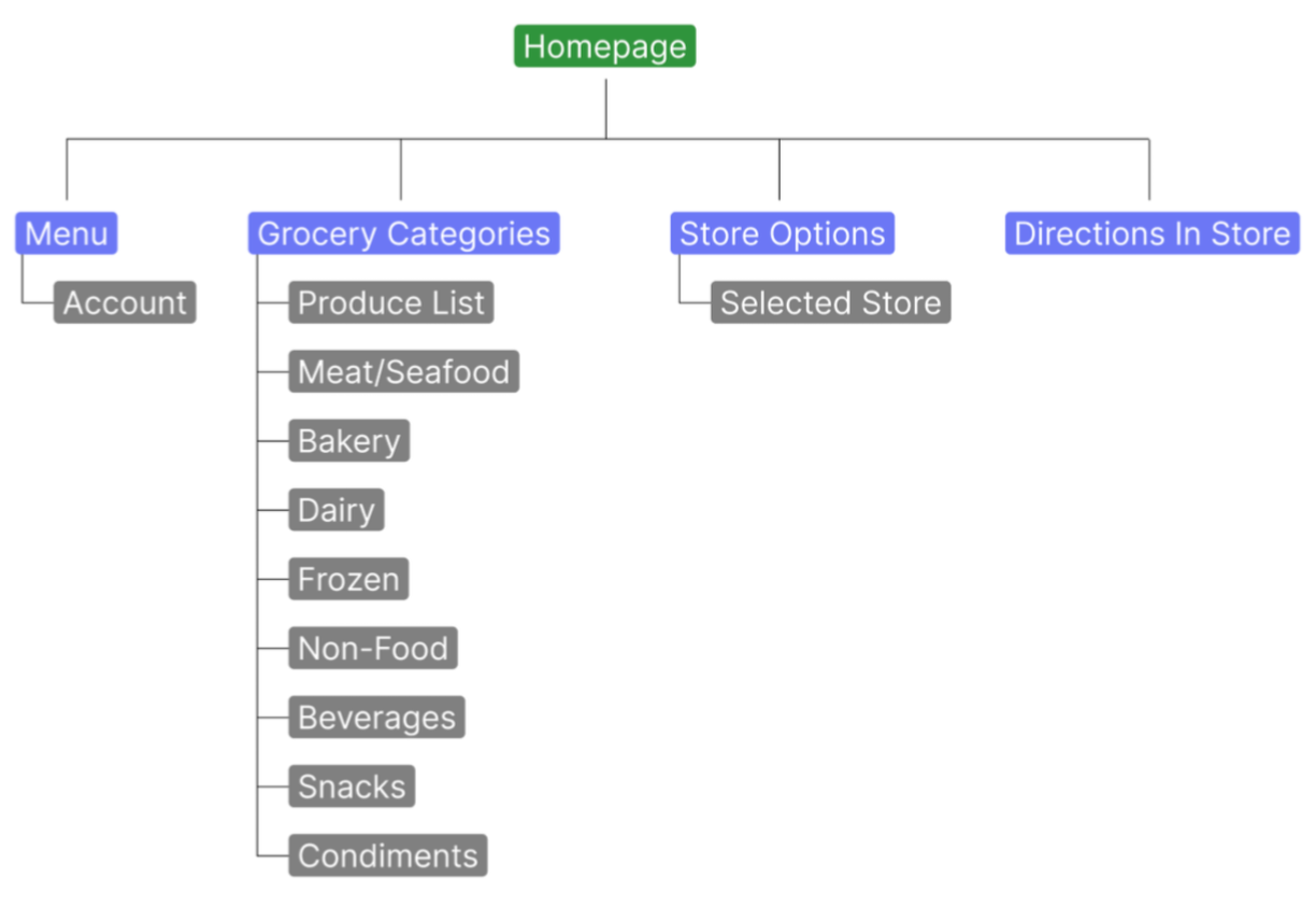
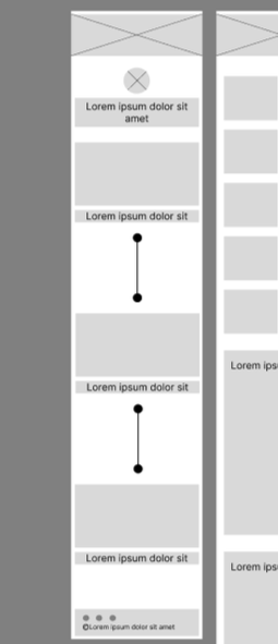
Creating the user flow helped me identify the most direct path for users to accomplish their goals. From there, I developed a sitemap to organize the app’s content and establish the structure of the experience. Using these as a foundation, I created paper wireframes to explore different layouts and determine how information and navigation could be presented clearly and efficiently across platforms.
Sitemap
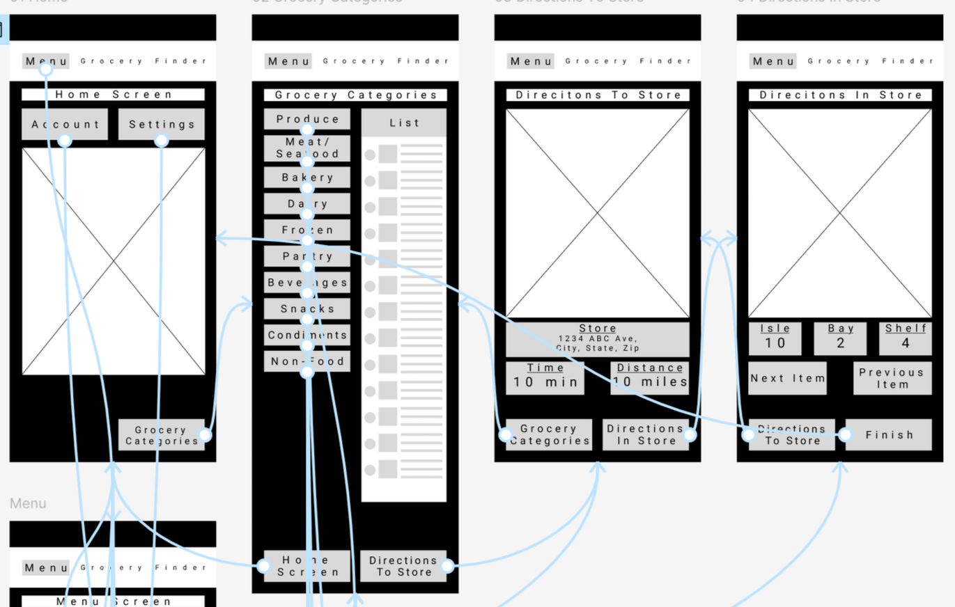
Digital Wireframes
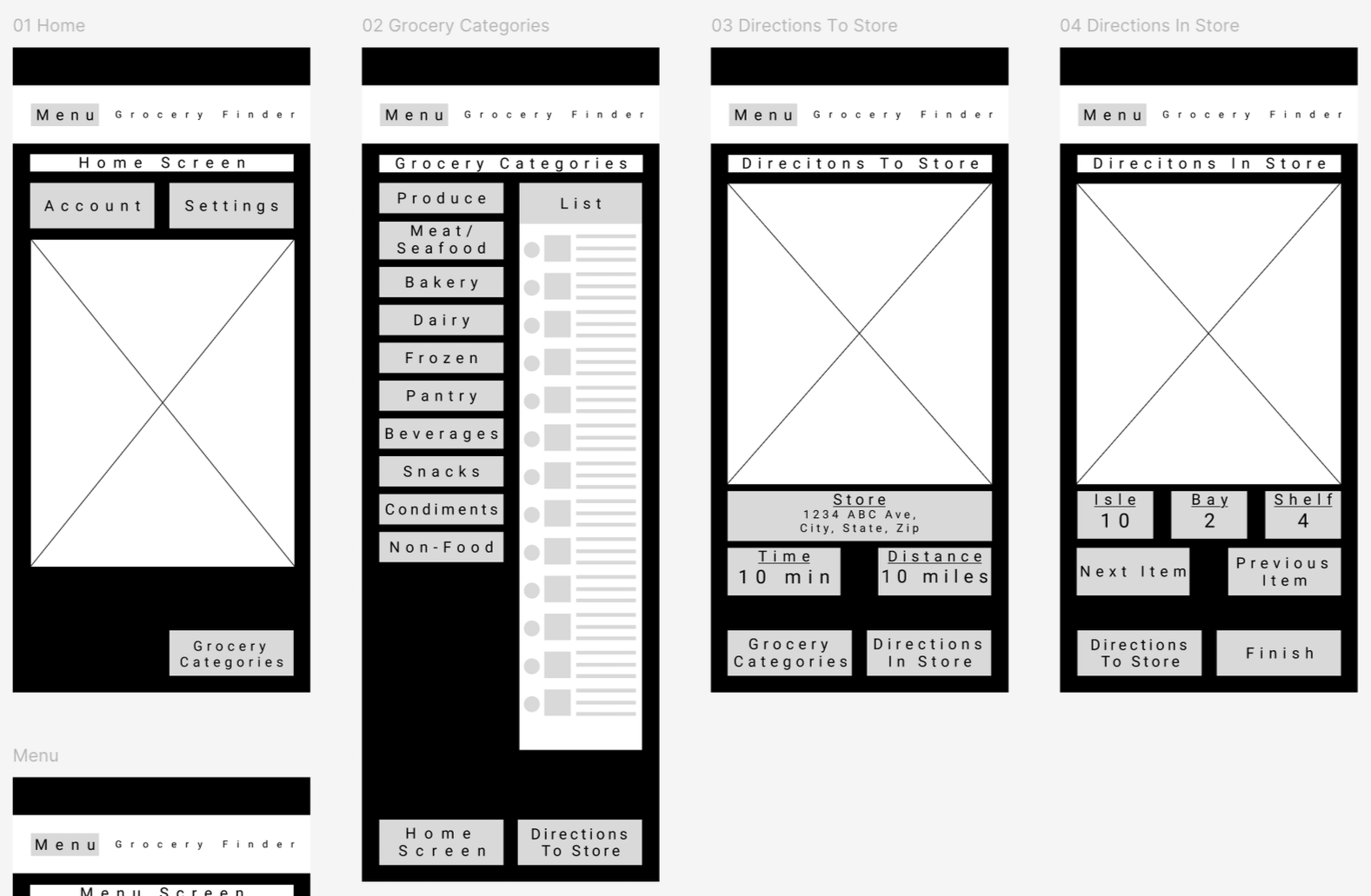
I used digital wireframes to establish the foundation and layout of the experience across platforms. This allowed me to explore the most effective layout for quick and easy use while keeping the design practical to develop within the company’s budget and stakeholder requirements.
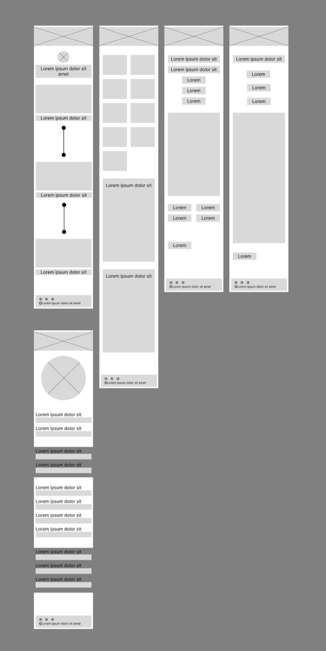


Customizable views based on the user’s needs
Low Fidelity Mockup
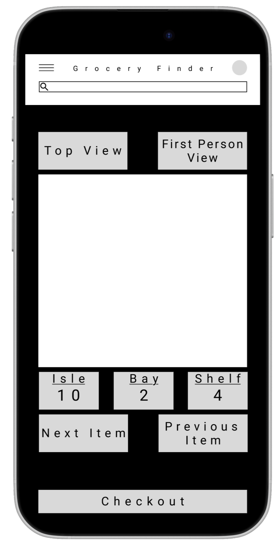
Based on user feedback, I simplified the design further and focused on making the interface easier to read. The home screen allows users to customize the app and account settings according to their needs.
Large type and generous spacing for quick, easy reading
Low Fidelity Prototype
Usability Study
1 - Users want clearer descriptions of buttons
2 - Users want clearer descriptions of type of screen they are in
3 - Users want feedback on their actions

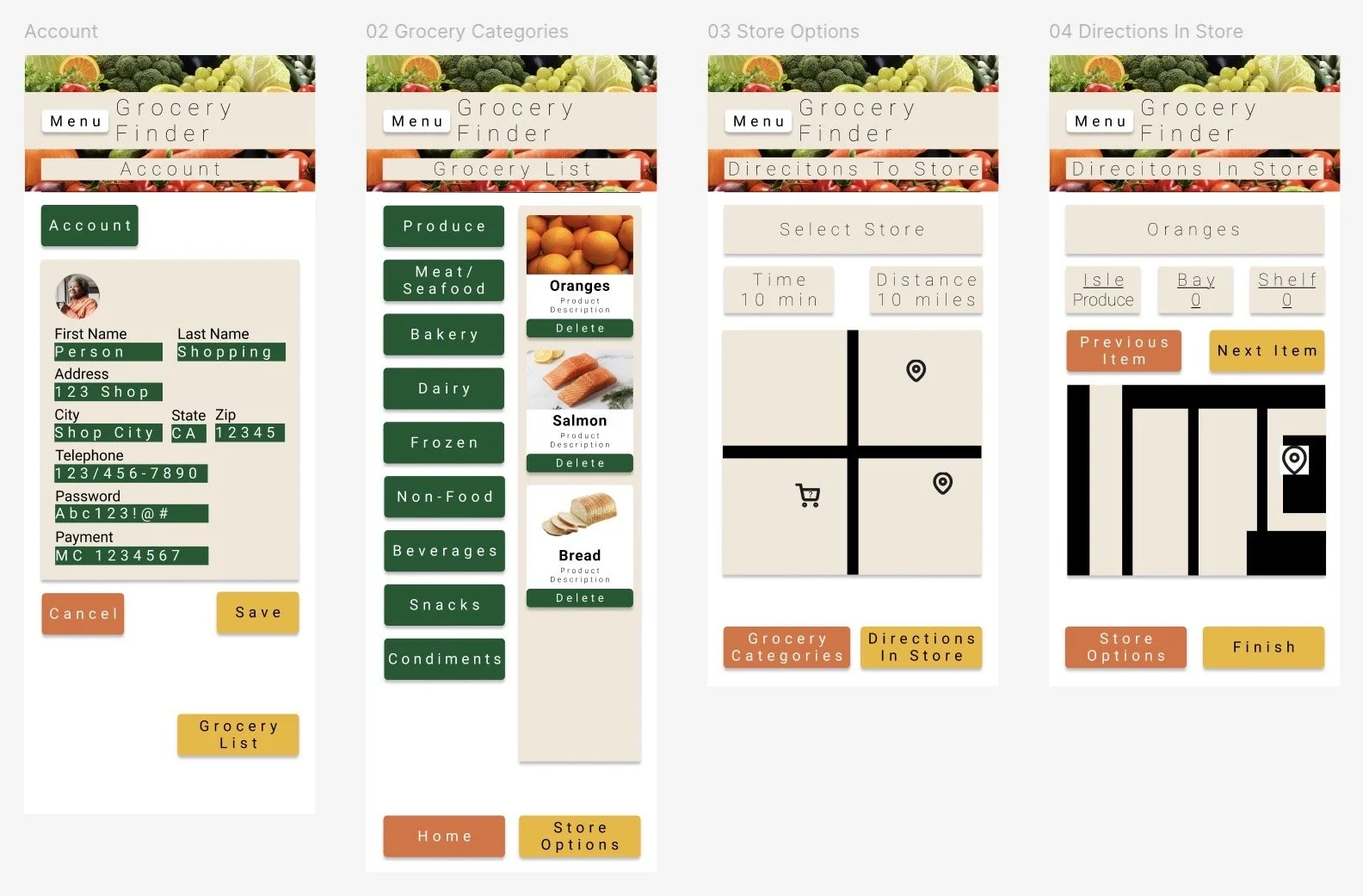

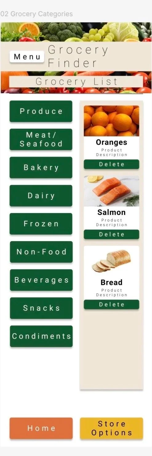
Large product images support quick visual recognition.
High Fidelity Mockup
Based on user feedback, I simplified the design further and focused on making the interface easier to read. The home screen also allows users to customize the app and account settings to fit their needs.
Large type makes product names easier to scan and identify.
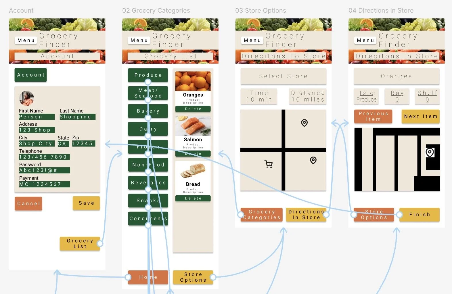
High Fidelity Prototype
Usability Study
1 - Users liked the color coding, which provided a quick understanding of each button’s function
2 - Users liked the large, clear text, which made the interface easier to read

What I Learned
I learned that designing for accessibility requires understanding different users’ needs and creating simple, intuitive ways for them to interact with a product.
Takeaways
Grocery Finder App
Impact
Users appreciated an app designed with the needs of older adults and people with dementia or Alzheimer’s in mind.
Next Steps
Continue user studies to explore additional ways users can input information and interact with the app.